Home Design
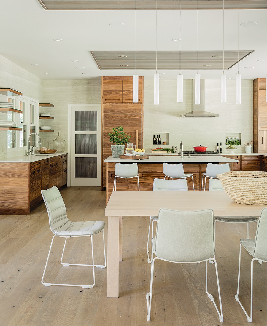
The design team used the lush landscape as inspiration for the space's organic palette.

Photo by Michael J. Lee
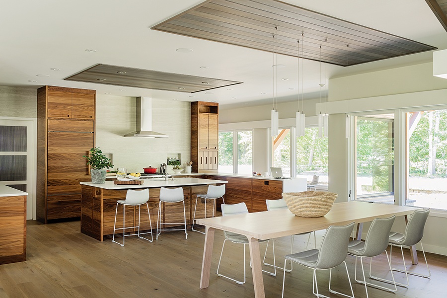
Armed with plans to downsize, a Martha’s Vineyard couple didn’t need to look far beyond their current Chilmark property. In fact, the homeowners built their new, smaller house on a lot right next door. At the center of the project? A 380-square-foot kitchen for hosting dinner parties, entertaining grandkids, and working. “[It’s] the hub of social activity,” says R+D Studio principal Travis Ritchie, who worked alongside Martha’s Vineyard Interior Design principal Liz Stiving.
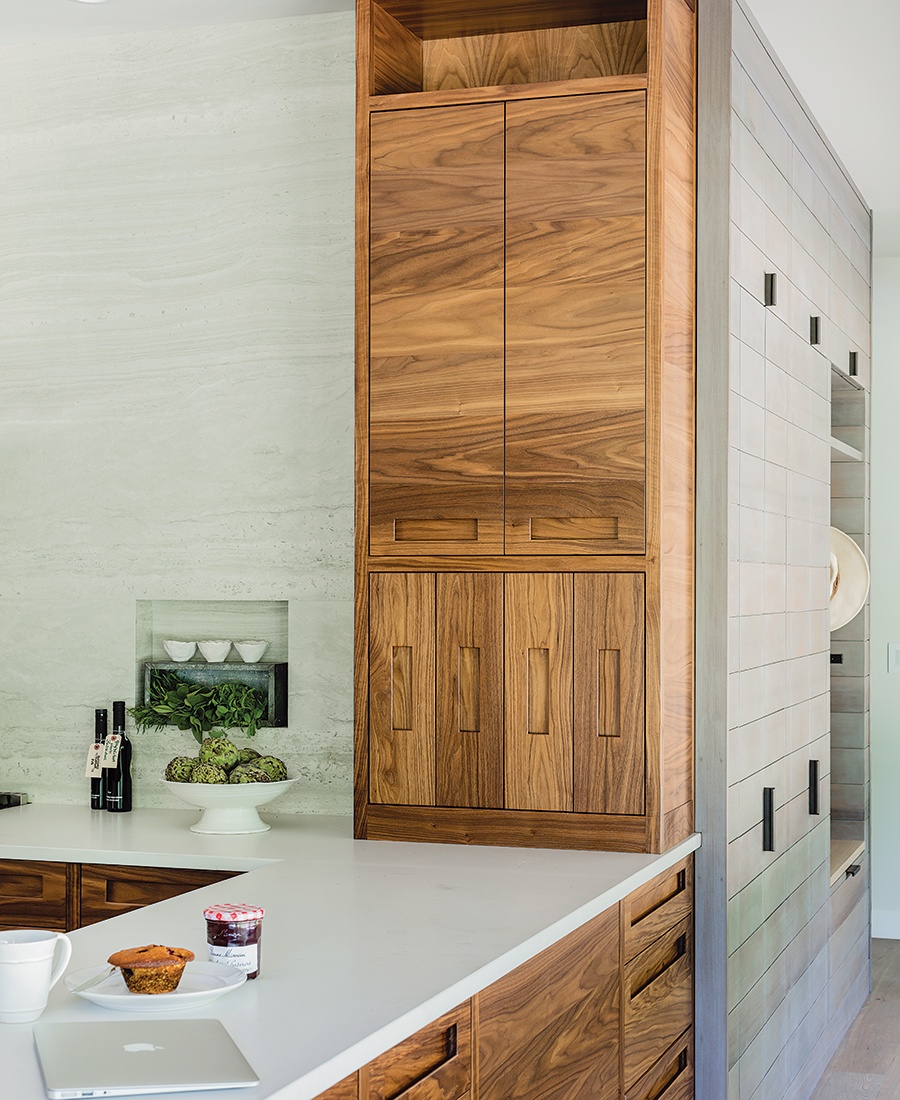
Inspired by the lush landscape, the kitchen relies heavily upon rich woods. “There’s so much beautiful greenery [that it] drove us to stay within an organic, natural palette,” Stiving says. That meant opting for walnut cabinetry, outfitted with recessed pulls that preserve the wood’s swirling patterns, to conceal appliances, spices, and work materials. To further enhance the kitchen’s connection to the outdoors, the team used panels of cedar—which also clads the home’s exterior—to dress up the ceiling while framing the Caesarstone-topped island and Shakuff pendant lights.
With the abundant wood detailing in place, Stiving aimed to balance the scheme by choosing a light-gray Neolith backsplash. Featuring minimal grout lines, the stone decorates two walls and includes a pair of niches for olive oil and other ingredients. “We wanted something beautiful in its own right,” Stiving says. “[The backsplash is] successful in the way that it allows the cabinetry to become center stage.”

Photo by Michael J. Lee

Photo by Michael J. Lee
CONTRACTORS
Architect R+D Studio
Contractor Stedman Construction
Interior Designer Martha’s Vineyard Interior Design
Millworker Jutras Woodworking
Stone Installer Timeless Stoneworks
DETAILS
Appliances Sub-Zero refrigerator and wine fridge, Wolf range and hood, and Bosch dishwashers, all Crane Appliance.
Backsplash/Countertops Neolith “Strata Argentum” and “Fresh Concrete,” both Mid-Cape Home Centers.

Illustration by Marisa Seguin
TIPS
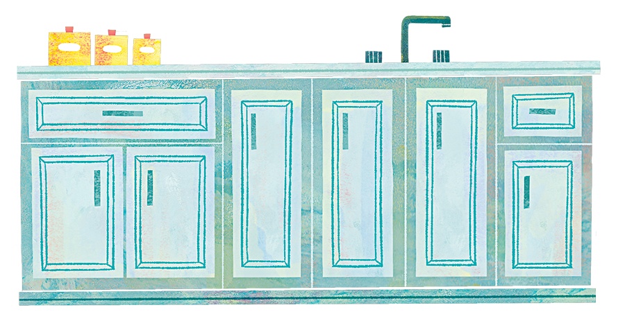
Follow these four foolproof pointers from designer Travis Ritchie, and watch your kitchen-cabinet dreams come to life.
Strive for Cohesion
Don’t settle on cabinetry materials and finishes until you’ve locked down all other design details, including flooring, countertops, and the overall color palette. “Rarely do you nail it on the first attempt,” Ritchie says.
Embrace Light
To keep your space bright and airy, minimize the use of uppers when possible. If you need them to maximize storage, installing cabinets with glass fronts “can help bounce light deeper into a room,” Ritchie says. Alternatively, you can “try using [cantilevered] shelves around the windows [instead],” the designer adds.
Consider Ergonomics
Easy access is key. “A well-placed niche can provide the space needed for a paper-towel holder, spices, cooking oil, or other items that you want close at hand,” Ritchie explains. As for cabinet interiors, “Shelves with heavier items can lift up with assistance from a piston,” he says, “and drawers [can] overextend to allow full access from the side or top.”
Test (and Retest) Hardware
Refine the shape and contour of the pulls or knobs until they feel right. “[They] should fit the hands that [use] them,” Ritchie says. “See and touch samples before you commit to production.” And remember, the designer cautions, that recessed pulls can be especially difficult to clean (think: cake batter smeared into tight corners). Consider test-cleaning them to figure out if they’re practical.
See the rest of the Kitchens Guide 2020.
"filled" - Google News
August 18, 2020 at 08:12PM
https://ift.tt/345Zn0C
A Walnut- and Cedar-Filled Kitchen on Martha's Vineyard - Boston magazine
"filled" - Google News
https://ift.tt/2ynNS75
https://ift.tt/3feNbO7
Bagikan Berita Ini


0 Response to "A Walnut- and Cedar-Filled Kitchen on Martha's Vineyard - Boston magazine"
Post a Comment